House2Home
design sprint : building customer confidence in online shopping
Overview
PROJECT DETAIL
Website Design
Google Ventures Design Sprint
May 2024
ROLE
UX Researcher
UX Designer
UX Prototyper
TOOL
Marvel
Zoom
TIMELINE
5 Days Design Sprint
May 18th -May 24th 2024

HIGHLIGHT
In this design sprint project, I am building confidence in online shopping by promoting personalized recommendations and increasing product visualization.
INTRODUCTION
House2Home is an online decor shop that sells decor kits and helps people decorate their new homes. In the current user research and interviews, House2Home found some problems that users faced when users shop with them.
As the solo UX designer in this project, I spent approximately 5 days solving the problems using the GV(Google Ventures) design sprint method, including defining the problems, sketching solutions, picking the best solution, creating prototypes and testing with users.

Design process

Jake Knapp & John Zeratsky, The Design Sprint, https://www.thesprintbook.com/the-design-sprint
PROBLEMS
According to the provided user research and interviews, I found users lack of confidence in online shopping for home decorations. Budget, Time & Effort and Uncertainty of the Decorative Effect are the major problems that most users mentioned.
SOLUTIONS
At the end of the project, I promote personalized recommendations through a questionnaire and allow customers to visualize products in their real space before purchase to provide customers with a budget-friendly, efficient online shopping experience.

Day 1: problems Understanding & Mapping
PROBLEMS, INSIGHTS & HMW STATEMENTS
Concept, user research, interviews and personas were provided by House2home for this project. I synthesized the user research and interviews and transformed the findings into HMW statements at the beginning of the day:
How might we help people find the right decorations in their budget?
How might we show the final decorative effect so that people can feel confident in their purchase decisions?
How might we help people save time and effort in the purchase process so that they can select the best things to buy quickly and easily?
END TO END EXPERIENCE MAP


After Synthesizing the problems and sights, I brought the goals into the mapping process and created a few possible end-to-end user experience maps( left two images below), and selected the best map can address the problem and conveys to solution( right image below).


Day 2: Solution Sketchings
MODIFIED LIGHTNING DEMOS (INSPRAITONS)
Before sketching solutions on the second day, I started to find some inspirations online, and there are some excellent examples below during the lighting demos :
Amazon
Crate & Barrel
MAC consomics
All of their websites have advantages and disadvantages, although they might have different methods to reach their goals, they all have two similar features on their website: Helping users to choose suitable items and allowing users to try items online before purchase, which inspired my design a lot!
AMAZON
Shoppers can select the most suitable item by various filters (Including budget, colours, size etc…). Then, try and view it in the room after selecting an item. Open the camera for Real-time display to use Virtual Reality

CRATE & BARREL
Customers can “shop a room” to browse a bundle of items as a kit. They also have the option to view the furniture in the room on the website after choosing certain items and show a QR code to scan on their mobile phone. They will direct open the website on your mobile phone and place the item in your room

Customers can choose a suitable lipstick colour in the “find my lipstick” filter. Then, customers can either try the live camera, upload photos or choose a model to start and try consomic anytime on their website

SOLUTION SKETCH
Now, Let’s discover deeper. The most crucial screen that I selected in the Crazy 8 is Trying starter kit items in my room. I focused on that main screen and the screens before and after the main screen, they are: Selecting a method to try items online and adding the starter kit to my cart.

CRAZY 8 EXERCISE
In the Crazy 8 exercise, I referred back to the end-to-end user experience map that was created on day 1, and combined inspirations from lightning demos. Then, I sketched different screens of how to promote personalized recommendations for starter kits and how to try items in the room online. Finally, I selected the most crucial screen of the process to discover more next.

MAC CONSOMICS
Day 3: Creating a Storyboard
PROTOTYPE VERSION 1.0
On day 3, I created a 9-screen storyboard to demonstrate the solution. As what I discovered on day 2, there are two major solutions: recommending personalized starter kits and virtual try-on items in a room. To save customers time and effort, there is a questionnaire instead of a filter feature, customers just need to answer serval questions before getting personalized starter kits. Then, customers can select one of the ways to try items in their room before they decide to make a purchase or not.

Day 4: Creating A Realistic Facade
STORYBOARD
The prototyping day! Since it is a solo 5 day design sprint project, I used Marvel to create a quick mockup and prototype. There are some major screens of the first version prototype below, including:


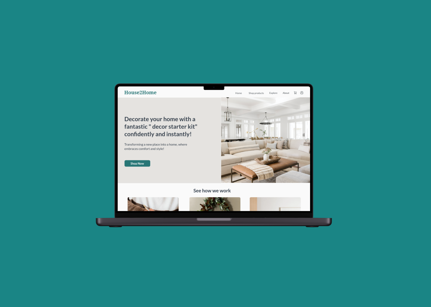
HOME PAGE
THE QUESTIONNAIRE

PERSONALIZED RECOMMENDATION AND DETAIL PAGE

VIEW IN MY ROOM
Day 5: Userbility tests & Iteration
USER TEST & SOLUTION VERIFICATION
I invited 5 interviewees, aged between 20-45 years old and who like shopping for home decor online to participate in my usability tests. It was an honour to hear that all of the interviewees thought the solutions of promoting personalized recommendations and increasing product visualization built enough confidence for their online home decor shopping.
However, some iterative issues were found during the tests, and I organized them into a problem log for interaction.

ITERATIVE PROTOTYPE
I iterated the prototype finally on day 5 based on the feedback and problem log of the usability test. The major iterations including:

Having a continue button in the budget question instead of the previous design, users can free to change the options before go next step, make sure the design is consistent. ➡️

By highlighting the items included in the starter kit when hovering over a kit section, customers can know what they will get before clicking on the detail page. ➡️
⬅️ Redesigning the icons and terminologies for each try-on option, make sure customers select the correct one that they want to use.


⬅️ Rewriting the header of the hero page, guiding users on where to shop starter kits

⬅️ Improving the UI elements, make sure the boards are clear and more significant.
The Final Prototype
REFLECTIONS
As a former textile designer, I was so excited to use both my textile knowledge (I meant….how to decorate a place with textiles, as you can see there are some textile selections in the images) and my UX UI knowledge to improve users’ online home decor shopping experience.
In this GV design sprint project, I also understand that time management and speed are important elements in the product design process. We as a UX designer should learn how to design effectively!
NEXT STEPS
Tests are never stopped, having more usability tests to improve the solution.
A better try-it-on interface, lets users try on starter kits easily.
Allowing their purchases more flexible, for example: switching or modifying the items in a kit.
