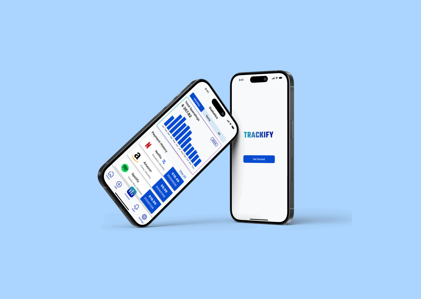
Trackify
Assisting Individuals to Manage Subscriptions Anytime and Anywhere
OVERVIEW
PROJECT DETAIL
Individual Capstone Project
Mobile App Design
June - July 2024
ROLE
Project Planner
Product & UI Designer
Branding
TIMELINE
Summer 2024
4 Weeks
TOOL
Figma
Zoom

HIGHLIGHT
Trackify is a mobile app that allows users to manage and optimize their expenses on subscriptions at anytime and from anywhere.
PROJECT BACKGROUND
We were given a scenario: Managing multiple subscriptions is a challenge nowadays, a company has a product that helps users keep track of their monthly subscriptions over the years. However, This company has only launched a desktop-only website that is not mobile-friendly.
Now as a UX designer, I was asked to design a mobile version of its product that can be used by a broader.


DISCOVER THE PROBLEM
PROBLEM SPACE
Lack of Mobile Accessibility: The current product is only available on a desktop website, which is not mobile-friendly, limiting its accessibility and user base.
Complexity and fragmentation of Subscription management: Users struggle to keep track of and integrate numerous subscriptions across different platforms, leading to unwanted and unnecessary charges.
Then, I conducted user interviews to understand users’ needs and behaviours and design better.
(We will talk more about it below.)
HOW MY DESIGN RESOLVED THE PROBLEM
KEY FEATURES
Manage all subscriptions in one place: Developing features that allow users to manage all their subscriptions in one place, providing a clear overview of their spending on subscriptions.
Scan previous transactions to add subscriptions: Allowing users to scan previous payments to identify and add subscriptions automatically.
Unsubscribe Functionality: This allows users to easily unsubscribe from services they no longer need, helping them to manage their expenses more effectively.
Renewal Notifications: Getting alerts for upcoming subscription renewals, allowing users to make informed decisions about whether to continue or cancel their subscriptions, thus avoiding unwanted charges.
👇 See How I got here 👇

KEEP PROJECT ON TRACK
PROJECT PLAN
A project plan is an immensely useful tool that I use to make sure everything stays organized. So, the first step that I did was outlining all of the necessary steps that I will take to complete the product, including methods, and deliverables.

SECONDARY RESEARCH
COMPETITIVE ANALYSIS
After creating the project plan and research plan, I conducted a competitive analysis to evaluate the market leaders for insights and Strategies of the top subscription management app, including:
Subscriptions
Bobby (Billy)
Subcrub
I found each app has different advantages and disadvantages, such as: Subscriptions offers comprehensive management and notifications, but has subscription fees, and limited customization. Bobby (Billy) excels in automatic subscription tracking, expense insights, and custom alerts but the style of user interface might affect trust. Subcrub provides custom tracking, detailed reminders, and user customization but requires manual entry, and lacks automatic detection.

⬆️ Subscriptions
⬆️ Bobby (Billy)
PRIMARY RESEARCH
USER INTERVIEW

Before conducting user interviews, I sent out a recruitment form to find suitable participants for the interviews.
The interviewees should be 18 - 40 years old, tech amateurs who have multiple subscriptions and diverse backgrounds in terms of occupation, income, and geographic location.
I interviewed 5 suitable participants after the screening, and the interviews focused on
How do the participants manage their subscriptions?
What are the pain points users face when managing multiple subscriptions?
What features do users find most valuable in existing subscription management apps?

⬆️ Subcrub


RESEARCH TAKEAWAY
KEY FINDINGS
2 of the 5 participants manage their subscriptions manually and rely on memory, and the other 3 participants use calendars or financial management apps to keep track of subscriptions.
Most users rely on email notifications of subscription renewal and bank payment history to monitor their subscriptions.
3 participants had an experience of forgetting to cancel subscriptions or free trials before the renewal date which led to unnecessary expenses.
Most subscription management apps in the market can only track expenses, users still need to visit the service provider’s website to cancel or change a plan, their functionality is limited
RESEARCH SYNTHESIS
To better understand the product users and their needs, I created a persona called “Arvin”, he is a fictional character that was developed based on the research and interviews.
Arvin is a newly graduated student in San Francisco, California who loves technology products so much. wants to find a way to manage his subscriptions efficiently, because his subscriptions are too dispersed, and he needs lots of effort to manage them at the current stage.
PERSONAS

JOURNEY MAP
Then, I also built a journey map to visualize what Arvin goes through to accomplish the goal of “managing his multiple subscriptions” and how he feels and thoughts when using the mobile app.
As a user, Arvin might have different goals to accomplish at each step, and there are some pains that he might experience during the process, such as:
“How should I know this app is the most suitable app for my needs? there are many different options” in the stage of discovery and onboarding.
There are too many subscriptions that need to be manually inputted into the app, it takes time for users when set up their accounts.
He might also miss some chances to cancel or change plans before the next payment cycle in his daily use.
The cancellation process might still complicated for him, even though he can track subscriptions and payments, because he still needs to go to the official websites to cancel.
He might doubt if the app can be helpful for his financial budgeting during the use.
and more …….

MINIMUM VIABLE PRODUCT
WITH JUST ENOUGH FEATURES
Combining with the existing business problem space (what we mentioned above), it’s time to summarize the synthesis for the future design process!
These three “How Might We” statements below are what I finalized “MVP” features for the product:
HMW make adding existing subscriptions quicker and less prone to errors for users.
HMW simplify the process of unsubscribing from subscriptions to help users reduce unnecessary expenses effortlessly.
HMW notify users about upcoming auto-renewals to enable timely decisions on whether to continue or cancel their subscriptions.


IDEAL INTERACTIONS
USER FLOWS
I built a user flow for each MVP to better understand the users and how users interact with the mobile app,
Also, to align with the business goals of making a simple and easy mobile product, I questioned myself during the process:
How to minimize the steps of the process?
How to Provide seamless cross-platform experiences?

DESIGN PROCESS

dOING THE RIGHT THINGS AND DESIGN THE THINGS RIGHT

⬆️ Paper Wireframe

⬆️ Low Fidelity Wireframes
VISUAL DESIGN

⬆️ Mid Fidelity Mockups

⬆️ First iterated High -Fidelity Mockups
As an individual financial management tool, the brand and visual design emphasize being "Reliable, Secure, Timely, and Insightful."

⬆️ Brand Design

⬆️ Style Guide
PAPER WIREFRAMES
I offloaded my ideas during the paper wire-framing process, including outline the sturctures and and functionality of the three main user flows.
DIGITAL WIREFRAMES
MID & HIGH FIDELITY PROTOTYPES
After the style guide was set, I applied it to the wireframes and prepared for the first round of user tests.
Several issues were detected after the first round of usability tests (We will talk about them later below) and solved in the first iterated Hi-Fi prototype.
USABILITY TESTS AND ITERATIONS
2 ROUND TESTS, 10 USERS, 3 VERSIONS
In order to find the appropriate style and interactions that accommodate all the solutions that mentioned above, I did total 2 rounds usability tests with 10 users, and iterated 3 versions.
PROBLEM LOGS
After each round of the tests, I generated the issues that each user experienced into a problem log, These problems include some iterated issues during the tests, UI elements that need to be developed more, and missing functionalities.

⬆️Problem Log after the first round usability test

⬆️Problem Log after the second round usability test
ITERATED PROTOTYPES BEFORE AND AFTER


TAKEAWAYS
REFLECTIONS
It was an invaluable learning experience! Throughout the development process, I gained a deeper understanding of how to plan each phase of the project to ensure timely delivery and high-quality outcomes.
Another key takeaway was how to balance product goals and user goals. Balancing these dual aspects was crucial in developing a comprehensive solution that enhances user satisfaction while driving business growth.
WHAT’S NEXT?
More in-depth explorations on motion and animation to enhance user experience.
Broadening a bigger and wider scope of functionality, such as features of financial planning, budgeting etc…
A more streamlined design process
⬆️ View the Final Product Prototype